An
exercise on perception
Human perception and visualization is a huge subject. How does one best
use light, colour, movement etc.
There is not time enough to look at these aspects of visualization in
this course. So apart from the following exercises I refer the
interested student to: Colin Ware, Information Visualization,
perception for design. Morgan Kaufmann, 2004, 2nd ed. Can be bought
from Ad
Libris or Amazon,
for example. The first edition (2000) is available as an e-book through
the Chalmers library.
Just to show some aspects of how the visual system works (and to train
on some Matlab) here are a few exercises:
 Draw a sequence of 40 adjacent
vertical rectangles in a window.
Colour the rectangles using a gray scale; the leftmost rectangle
should be white and the rightmost black. Set the Edgecolor-property of
the rectangles to None. Look at the border between rectangles. Do you
notice anything special? The visual system is sensitive to
changes, it does not measure absolute values.
Draw a sequence of 40 adjacent
vertical rectangles in a window.
Colour the rectangles using a gray scale; the leftmost rectangle
should be white and the rightmost black. Set the Edgecolor-property of
the rectangles to None. Look at the border between rectangles. Do you
notice anything special? The visual system is sensitive to
changes, it does not measure absolute values.
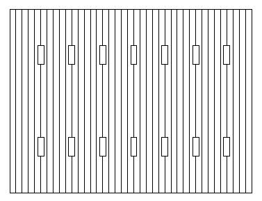
Use the previous image and draw
superimposed, smaller rectangles, like this (where I have filled all
the rectangles with white; also this image is smaller than necessary).
The
small rectangles in the first row should all contain the same gray
colour, e.g. [0.3, 0.3, 0.3]. The small rectangles in the second row
should also have the same colour, try [0.8, 0.8, 0.8]. Comments?
Use the program from the first
exercise and change the colormap to pink, colormap(pink) . Then write
lines of text from the left edge to the right edge of the window. You
can try different colours for the text, but try at least using cyan.
What can you say about the readability of the text in different parts
of the window?
Research has shown that difference in colours is not suitable when
small details are displayed. Contrast in luminance (amount of light),
black/white, is more important.
You can find several interesting examples at Project
LITE.